Product Design Corner
Let’s talk about design for a moment, shall we?
This new black pill box looks slick. Sleek, modern, rounded, strong, and super secure. Modern fonts. Serious-sounding brand name. Not your grandmother’s kinda pill box, eh?
Now the old one being replaced. Other than Thursday PM being busted (chalk one up for the sturdier guy) let’s think about value for a moment.
Firstly, I’m not in the business of impressing you with my pill box. If I was, I’d just post this and be like “take that, loser pill box owners. Get with the times!” So no. I don’t need it to be sleek and slick, although next to my computer, it looks like a fancy accessory. Much cooler in the workplace. But then people be like “what’s that bad-ass device?” and then you’d have to say “That’s where I keep my Centrum, Viagra, and Geritol.” So yeah, nix that. I digress.
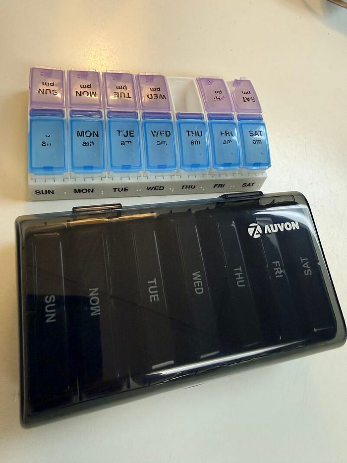
Anyway, let’s examine the jobs to be done here, using a ‘When I…I need to…so that…without’ approach.
1. When I need to take my pills, two times a day, I need to access the right ones so I can feel better without screwing up.
2. When I need to remember if I have taken my pills or not, I need to look at my pills so that I know I am good and can move on to other things without keeling over from lack of Vitamin D sitting inside staring at a screen all day.
3. When I travel with my pills I need them to be secured in my luggage or bag so that they don’t spill out all over the damn place from loose caps or breakage so I don’t lose track of the timing.
JTBD 1: Take pills
The old one
easy one-handed move to open and close (two clicks for software)
- Analog clicks: 2
The new one
Requires two hands to open the main box (two clicks coordinated). I’d take a video to show you this painful move but take my word for it. If I’m taking pills for arthritis, forget. Next, I gotta grab a box and fully put it out. Another two clicks but really more than that. A drag and drop. Next, another two-handed move for each daily box. Then I have to put it back, then close it. Two more “clicks”.
- 6 analog clicks, two with two hands and struggle, involving several more muscles and energy
- 2 coordinated drag-and-drops.
Who wins the first job to be done? Do the math.
JTBD 2: Check to remember if you’ve taken meds or not.
Old box: Look at it. That’s it. That is a view. If you keep the box in place, its a single effortless ‘scan path’. Granted, if youre like me, it’s an entire user journey through multiple screens and exploratory workflows, but that’s entirely the user to blame
- 1 gaze
New box:
Well who tf knows? I even shined a flashlight on it. Nothing. Totally opaque. I am I now have two jobs, which means
- 1 frustrating gaze
- See above, but make them, as we call them, ‘rage clicks’. 6 of them and twwo drag and drops
Lastly, JTBD 3: Travel with pills
Old box: I don’t have the user logs, but I can self-report spillage in bags, and a busted day.
New one wins, but not really. They didn’t consider planned obsolescence. Fail.
Old box wins